If you are a fan of colour like I am, you may well also be a fan of Pantone - not just colour experts, but guides in the world of colour fashion. In their own words:
"For over 50 years, Pantone has been inspiring design professionals with products, services and leading technology for the colorful exploration and expression of creativity. In 1963, Lawrence Herbert, Pantone's founder, created an innovative system for identifying, matching and communicating colors to solve the problems associated with producing accurate color matches in the graphic arts community. His insight that the spectrum is seen and interpreted differently by each individual led to the innovation of the PANTONE® MATCHING SYSTEM®, a book of standardized color in fan format."
So there you go! Now, I'm not necessarily very fashion-led - I wouldn't say I am unfashionable exactly (hopefully!!), just drawn to timeless, classic pieces - be they in wearable fashion, home furnishings or interior design - and even more than that, I am drawn to quirky, colourful design that doesn't quite fit into any fashion niche. I am more interested in the art that we wear and surround ourselves with being an expression of our true selves, and having an emotional connection with that art. It doesn't have to be high-brow or serious - but it does have to connect.
Nonetheless, I am always intrigued when Pantone brings out their Colour of the Year, and the palettes which they release twice a year. For 2016, they've changed things up a little, and selected two colours for this role - Rose Quartz and Serenity.
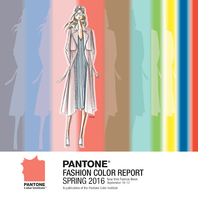
If you're a bright and saturated colour fan like me, you may be thinking 'meh' a little. Ok, I admit this was my first reaction! Old-fashioned 'gendered' baby colours. (Colours don't have a gender - something else I'm not a fan of! Hurray for boys in pink and girls in blue and everyone in all the colours of the rainbow.) But take a look at Pantone's Spring 2016 Colour Report palette:
I am a lot more of a fan of this larger selection - particular the brighter hues at the right-hand side (surprise surprise). I had secretly hoped that Snorkel Blue would be selected as 2016's colour of the year! However, seeing the soft pastels as part of a larger selection, I feel much more happier with them - they seem to make more sense to and for me. I've also begun a Pinterest board for Rose Quartz and Serenity, so that I can explore these colours in many different visual contexts.
And really, that is what I love about Pantone's palettes and colours of the year. They push me to work with colours and colour combinations that otherwise I might not. Cornflower and pale rose-pink? I admit, neither are the first colours I reach for when beginning designing. But seeing these over at Pantone and on Pinterest is somewhat of a challenge - it inspires me to try and incorporate them into my designs, and to make them work for me.
One of my first ports of call when exploring colour is to whip up some handwoven beads in whichever colours I am keen to explore. Look out for these in my own designs (particularly the Rose Quartz I have to say - I am in love with it's subtle shimmer, and delicately frosted exterior) - but if you are also a jewellery designer, then you can pick these up over at The Curious Bead Shop in various combinations - pairs, and sampler sets.
What do you think of the Pantone Colours of the Year? Are you drawn to them, or are they more of a challenge for you, as they are for me?


2 comments:
Separately I like them. Together not so much!
I like the two-tone beaded beads. Would be fun to see them next to a couple with mixed blue and pink beads just to see how one palette can look completely different depending on how you arrange the colours.
I'm with you on these old-fashioned baby gender colours. Colours not wow (even though you get my favourite colour purple when mixing them), but the interesting - and challenging - part comes when combining them with other colours. Especially the earthy ones I my case, and I'd add some dark colours for more depth. Mixing a meh colour with the right colours can create wow palettes.
Personally, I've got my strategy for my annual Colour of the Year challenge: layering. Be it in the form of lined transparent beads (e.g. blue-lined pink seeds/drops/triangles), combining thread and beads (e.g. pink embroidery floss for an embroidery with transparent blue beads), layering organza ribbons, finding encased lampwork beads or whatever else can be imagined. Why? Partly because I've focused on designs with layers of different-coloured sheer fabrics (organza dresses, tulle decorations) – and partly because I prefer purple/mauve/lavender to both pink and blue. ;)
Post a Comment